Imperial Styling Salon
This new page is similar to the Bonus Images page (where it began), in that it's 'upside down' with newest material at the top for minimal scrolling for updates. Entries are divided by stars (***).
H
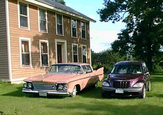
OLY HOT RODS, BATMAN! THE Mrs. CAUGHT A CRUISER!A
PURPLE ONE!**What a Comparison with Pinkie, our 61 Imperial Crown
**40 YEARS OF CHRYSLER STYLE
:Chrome
to Cruiser, Rococco to Rounded, Fins to Funk
Look on these two together.
Wonderful, Weep-worthy or just Weird?
(all in the eye of the beholder - personally, I love them both)
Low, Wide, Bright, Intricate Then. Tall, Small, Dark, Smooth Now.
Could these be more different and still both be cars? And yet, they share purity of concept - unabashed, strong characters with no-committee-compromise, coherent design statements.
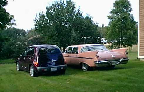
Oh, yes. Sharp then and Rounded now, but somehow, both are Curvaceous!
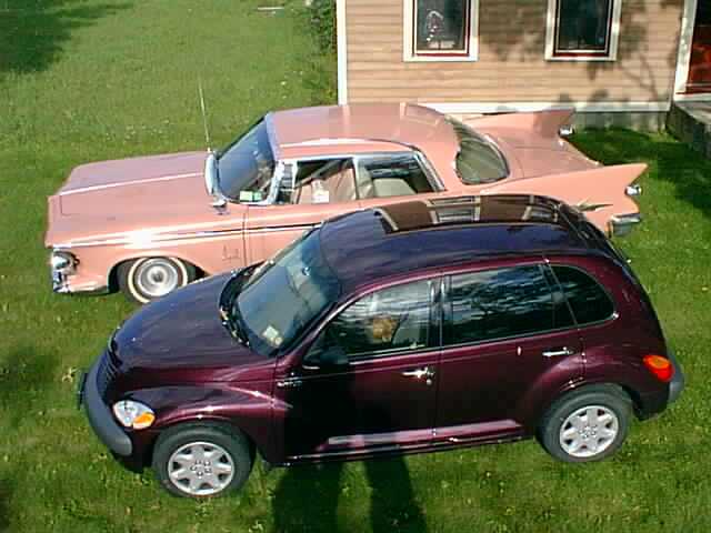
Note that both are 'Heritage' designs, using retro themes in a modern (when built) theme.
Exner used pod head lights, a central (not full-width) front fenders defined by wheel-arches and a tapered hood opening.
The Cruiser has the tapered hood, arched fenders, and a central grille, too!
Look how the headlights and taillights reflect each other on both cars: pods on stems in '61, teardrops swelling from the fenders in '01.
The perspective here distorts the size difference, but are these not Two Cool Cars?
***
FURTHER DEVELOPMENT OF THE UPDATED 61 IMPERIAL
Well, I had made some sketches in wondering about importing the essences of Exner's 61 styling into a modern idiom, respecting safety, structural, and underlying engineering improvements and requirements. Some discussion along the lines of a revival was introduced on-line and another member posted an idea sketch. So I posted the front 3/4 view in the previous Bonus segment (below the ***, below). The reaction was positive and encouraged me to go after the more difficult task of developing the rear end details. Capturing and integrating the front cues was easy. The 'eyebrow' fenders, eye 'sockets' that blend into a sweeping rise over the wheel arch, the fine lined grille, the full and open curved windshield. All these can and were fitted into a modern massing of underlying forms that preserved the power and (I hope) the integrity of the elements as a unified design, while providing a smooth, low-drag shape, pedestrian-friendly surfaces (funny-concept, isn't it? IF I hit you, would you think it 'friendly'?), and impact crumple zones.
Now comes the hard part! The original Exner design had extreme fins and a broad sloping rear deck. The taillights stand free on The C pillar drops to the belt line ahead of the fins and the rear doors have no relief over the wheel arch at all, emphasizing the length of the sweeping lines. These are all essential elements in the design and all in conflict with modern demands. How to integrate them????!!?
Early on (see the previous installment), I made two choices. The fins would remain, but become bas-relief in the flanks. The tops of the fins would blend into a high deck. I hoped I could capture the clean-sweep look (but not the Flite-sweep look) of the original in the taller new one. I hoped I could preserve the bold majesty of the fins, even as they were submerged below decks (so to speak). The second trick would be those trademark free-standing hanging-pod taillights. How in the world to make that work?!?!?! But I got an idea that with the higher deck, the nook of the fin where the original lights were nestled would become a scooped out corner cavity, echoing the eye sockets for the headlamps. I decided to line those cavities with a reflector and cover them with flush, clear lenses (rather like on recent Honda headlamps - no faceting on the lens. Then, a chrome bezel with a round red lens can be suspended in the clear lens! A backing pod (chromed of course) will be visible within the cavity and inside the lens. It actually goes the original one better in that there is no visible means of support at all! The basic taillight assembly floats in the lens, perfectly positioned in the nook of the fin with not even a visible stem to ground (wires hidden from view behind and inboard). To make it all the better, the pods have a small red lens on their forward ends, too, just like the original. Now, that light reflects off the cavity liner and out to the sides to make the side-marker lights without a separate lamp disturbing the flow of the body surfaces. And the brakes and signal lights are also mounted 'backwards' in the forward part of the pods, but hidden on the pods' inboard flanks. When they illuminate, the entire cavity reflectors glow bright red or yellow, surrounding the running taillight and magnifying its size.
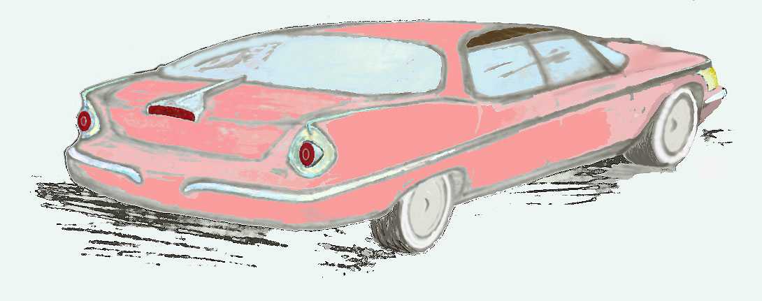
Well, I could see it well enough in my mind's eye, but what a devil to draw! Here's the result of the effort, a 3/4 rear view similar to the front 3/4 I showed before (below):

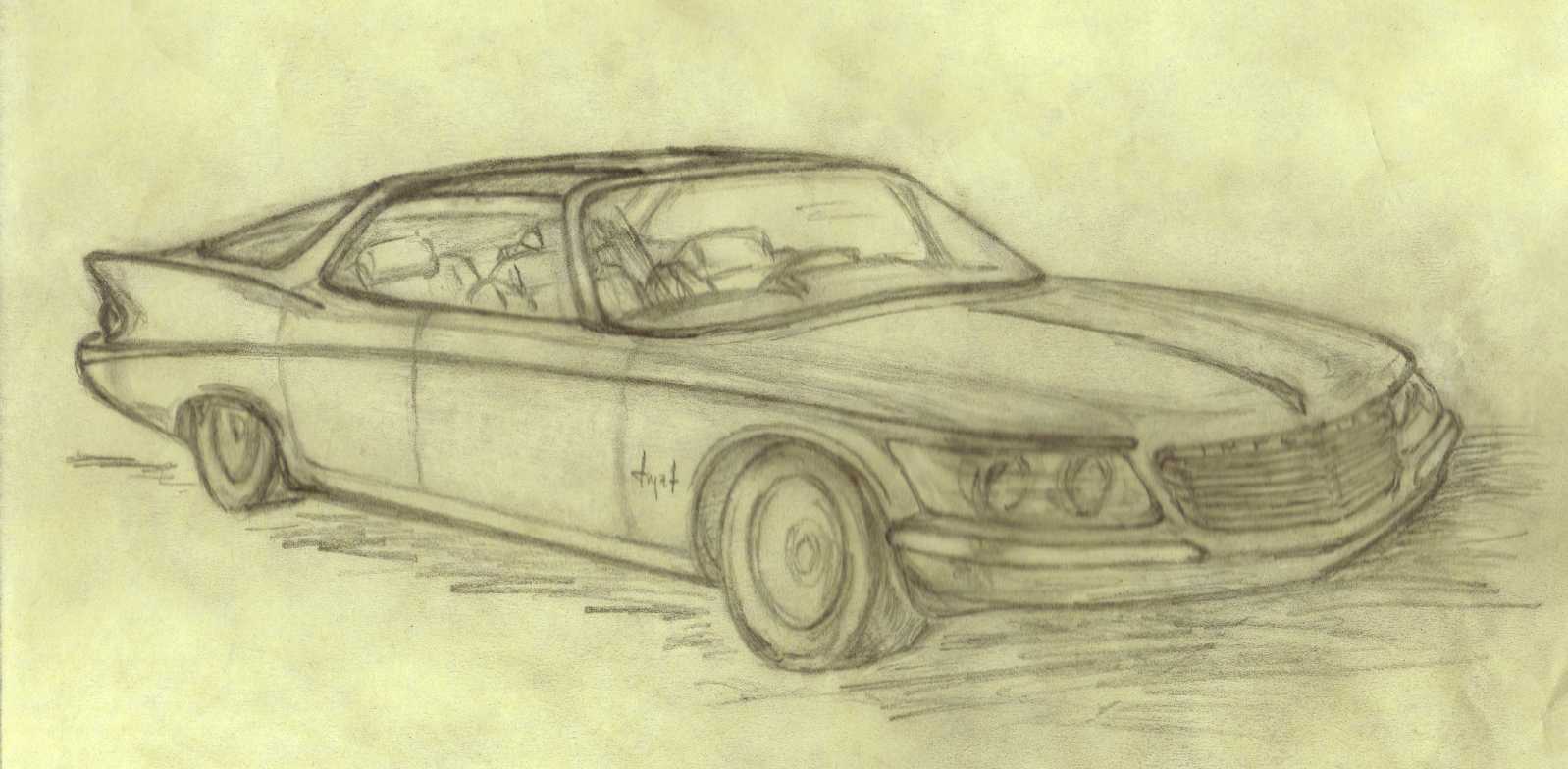
Imperial 1961+38, a Rear View (Shapely, No?)
First off, you can see: the Fins are In! They serve wonderfully well to lift the profile into the high deck, but there is really almost no fin at all, in the sense of projection above the decklid plane. The fins sweep inward topward the rear, too, a detail NOT present on the vertical-finned 61, but providing a gently-tapering body section to the rear for low air turbulence as it slips silently through the wind.
You can see (a bit) the taillight floating in the bright-finished nearer corner cavity and see the projection of the running light pod from the clear cavity lens on the far side. What do you think of the 'Airplane' trunk handle ornament doing double duty as the CHMSL? I'm quite pleased with the sweep and curve of the backlite, it captures wrap-around of the original in a wholly functional high-tail low-drag way and blends with the truncated (sorry!) rear deck to recreate that broad sloping surface that was so evident in the original trunk area. One departure from 61 practice is in the termination of the side sweep trim. Of course, on the 61's, it flared to include the fender eagle crests and then ended, still on the fender flank. Here is sweeps on around to form the bright inserts that define the crown of the bumper (complete with the center dip of the original), while still providing the solid (but visually softened) big basher bumpers. Yes, I DO believe in bumpers that can take a bump and protest the pricey parts like those taillight assemblies!
In this image I was able to correct some of the flaws in the front view. The side sweep is now properly nearly straight from stem to stern, not like that Buicky curve I had before. At the same time, I've thickened the flanks behind the front wheel, filling out the curve of the body there to add emphasis to that wheel arch form (to me it suggests driven rainspray off the top of the tire!). this also allows the eyebrow to curve gently inward toward the front, enabling the tapered nose I showed before and keeping the wind noise and fuel consumption down at high speeds.
I've made the C pillar more vertical (in the fore-aft sense) than before. The first sketch made that element look too coupe-like. This time it suggests a proper, more formal sedan - but it's still a true hardtop!. There was some dismay at my earlier suggestion of a fastback roofline. The more upright C pillar preserves the elegance of the cabin, while still allowing that fast back light for the broad rear and smooth airflow I wanted.
Well, that's it, mostly. I think it works I'd love to hear your reactions. I had a few minutes to play with this in Photoshop the other night, so I took a crack at colorizing it. I chose the 'Malibu Tan' of my parts car (NOT!), Pinkie. It came out rather cartoonish (mostly due to my inexperience with the software, but it's interesting and gives a different sense for the reflectivity in the taillamp cavities and you can see the chrome strips along the fin crests. Wild, huh?
***
IDEAS FOR AN IMPERIAL REVIVAL
Another member posted his sketch of a composite car including all those details that have made for memorable Imperials in the past. Well, as you know, I'm partial to Exner-era designs and 61's in particular. I had been sketching recently, too, along the lines of a modern revival with all the key styling cues of the 61 Imperial - How many of you remember the 1/25 scale models called Revell Revivals? They were released in 1966 and were imaginative exercises in contemporary interpretations of some classic-era great cars (Stutz, Duesenberg, etc.). The wild part is that someone actually made a business of the Stutz revival! They were based on Long-hood Pontiac Grands Prix and they looked just like the models! I believe the designer was none other than Tom Tjaarda, but I can’t prove it. (I have since heard it was our very own Virgil Exner!).
Anyway, here are my sketches on how one might make the theme and cues of a 61 Imperial fit into a modern era with safety regulations, and gas mileage concerns. Think of a car with about the size and overall planform of the current LHS (although with rear wheel drive!). The front concept was easy (though hard to illustrate). The eyebrow fenders remain, though swept back. The free-standing lights are faired in under glass (also a nod to the '64!). The lovely curves of the hood remain, although now they sweep down through a swept-back grille to a safety bumper with real chrome inserts. The design is very glassy (and classy!), preserving the open feel and look of the original. AND it's a hardtop. The primary chrome details (side sweeps, roof spears, etc) are retained, but blended more into the body, as enabled with modern tooling. Unquestionably, the hardest element to interpret is the tailfins. With injury-prone pedestrians and eager personal-injury attorneys all around, plus a requirement for a CHMSL (center high-mounted stop light), the rear end needs some real rework, but I wanted to keep the feel and form of the beautifully convex, full fins and sweeping deck. To do that, the broad deck is replaced with a broad backlite. This merges into a high tail (good aerodynamics), allowing the fins to become character features of the flanks, rather than standing free above the trunk. The dangling taillights are similarly blended in, still in the right places, but now integrated.
I dunno, what do you think:
Imperial 1961+38: A Modest Proposition
Do you like the way the sidechrome sweeps into the rear bumper? How about the relations between the headlight assemblies and the front wheel arch? Does the fastback look work for you (have you looked at recent Mercedes coupes and sedans)? Should those roof insets (stainless in 1961) be made of a new photochromic glass that darkens on bright days, but lets the sun in on dreary ones? I have no idea how to design the wheel (presumably chromed alloy units, and at LEAST 16 inch rims). I always loved the smooth dish wheels from 61-63.
Here are some earlier versions, added mostly to show some back end thoughts and to give some reference to the thinking behind the finished sketch above:
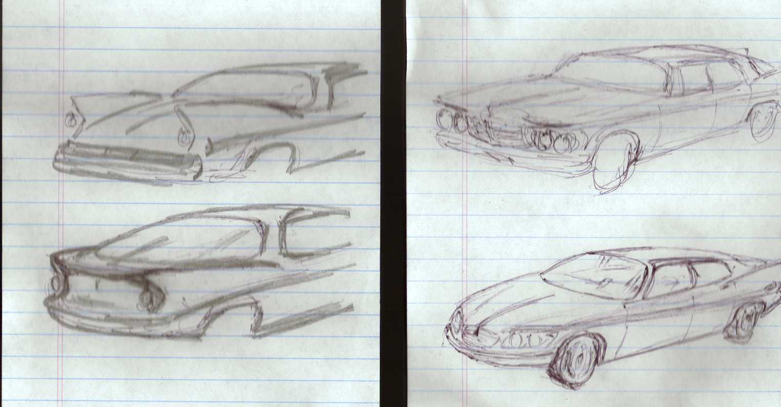
How to Do 1961 in 1999?, Some Doodles that Led to the Full Sketch Above
The first thing you'll notice here is that the fins are now blended into the high tail and form a kind of spoiler as well as a prominent styling feature of the flanks. Its not so clear from this view that the fins retain their original fullness (convex surfaces), but now the tips roll inward a bit more as the tail of the car tapers in (very un-61, I admit, but very good for low drag). The broad rear lite tries to give the same sweeping vista that was once offered by the rear deck. A CHMSL should fit well into the rim between the fins. The taillights are faired into the notch in the fin detail, but still carry prominent circular lens details. Note how the side chrome becomes the rear bumper definition - this is a nod to the 62-63 iterations of this same body- the same device used by Engel when he de-emphasized the fins. I think this is a bit more true to the cause (but then, I actually LIKE fins - he didn't). Sometimes this first sketch looks a bit like a Valiant and sometimes an Avanti. It is not wide enough (compared to height) as I've pictured it here.
The front view is a little closer to the final result. In some ways I even like it better. There's a little more tension and purposefulness to this than the final sketch. This is partly from the more rakish snout, partly from the extra rake in the windshield. A lot of the effect is from the blown-back look that happens when I draw from this perspective (a touch of astigmatism, perhaps?). There is a little more roundness to the mid-body section here that I like, too, that didn't make it to the detailed sketch (where Exner's higher shouldered section reasserted itself). In some ways, this looks like the next model after the finished sketch! On the other hand, the front has a distinctly Citroen DS21 flavor that leaves a bitter aftertaste. And of course, the rear end is unresolved because I ran off the edge of the notepad! Now that I compare the two, I see that the curve of the side sweep is better here, too. The finished one is a bit too high amidships, giving it extra curvature, like a Buick's. Oh well.
If any of you viewers share my interest and want to explore Design some more, please write! You can get me at
john.corey@chartindustries.com by email. We'll take it from there!Back to Front Page & Index